Everything FlowAudit does, end to end
Not a feature grid. This is the actual walkthrough: what you tell it, what comes back, how you prove the fixes worked, and how your team lives with it week to week. Skim the headings — or open any card and go as deep as you want.
No credit card required · about 90 seconds per audit
Ninety seconds, three beats
One flow, one goal, one ranked fix list. That loop is the whole product — everything below is detail on how each beat works.
You describe the flow
A URL or screenshots, the page type, and the outcome you actually want from it. Thirty seconds of typing.
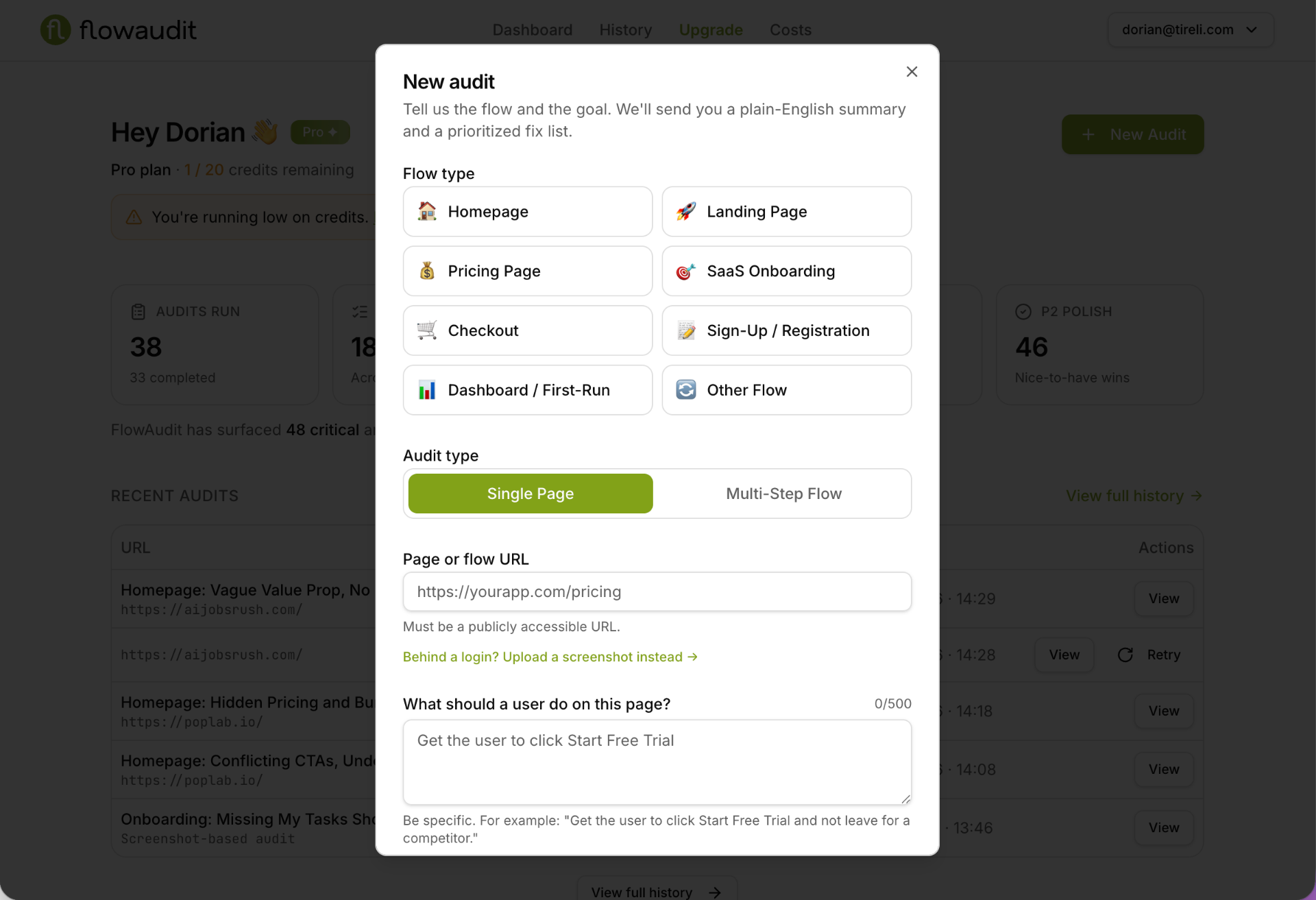
We review it like a consultant would
The page is captured and read against named UX heuristics, always judged against your stated goal — never a generic checklist.
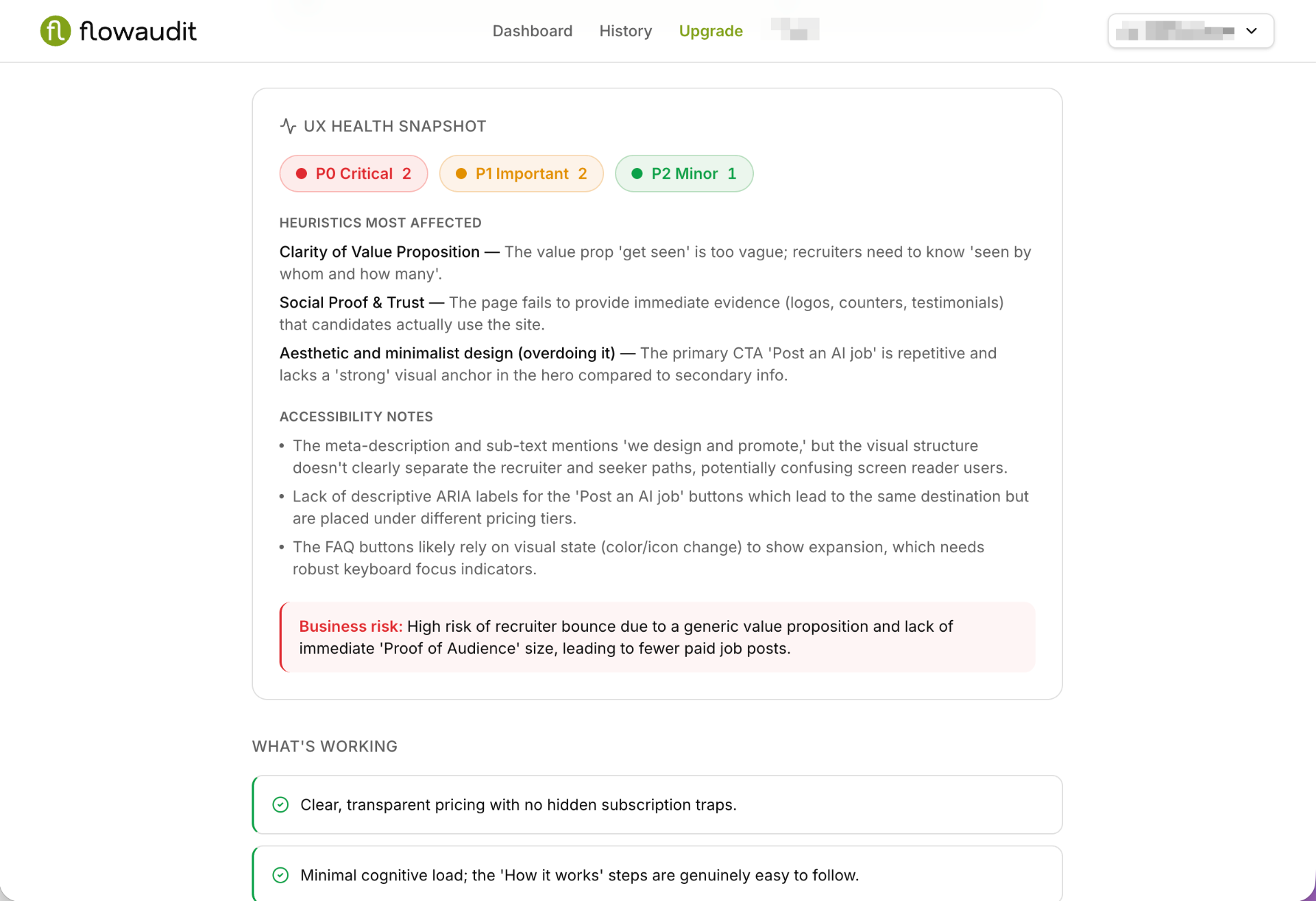
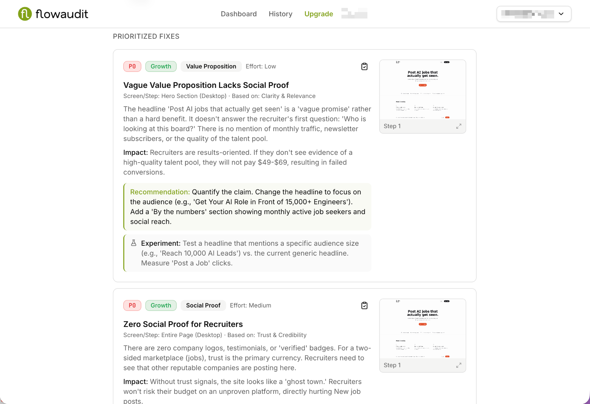
You get a backlog, not a score
A verdict, one fix to start with, then every other finding ranked P0/P1/P2 with copy you can paste.
The setup takes thirty seconds — and it decides everything
An audit is only as sharp as the brief. These five inputs are what turn a generic UX opinion into a review of your flow, for your users, against your goal.
A URL — or a screenshot
Paste any public URL and we capture the page ourselves. Behind a login, paywall, or still on localhost? Upload screenshots instead and the audit runs the same way.
Single page or multi-step flow
Audit one screen in isolation, or chain several screens together so the review reasons about the whole path — not just the pixels on one page.
Nine page types, including Auto-detect
Homepage, landing page, pricing, SaaS onboarding, checkout, sign-up, dashboard / first-run, other flow — or let Auto-detect pick, which is what most people do.
The goal, in your words
Quick-pick chips for the usual outcomes — start a trial, pick a plan, complete checkout, book a demo — plus a free-text field when your goal is more specific.
Audience and Angle
Tell it who is landing on the page and what perspective to review from. The same checkout reads very differently for a first-time buyer than for a returning enterprise procurement lead.
Auditing a Framer, Webflow, Stripe, Lemon Squeezy, or Supabase Auth flow? See the tool-specific guides →
A report shaped like a to-do list
Read top to bottom and it goes from verdict, to the one thing to fix first, to everything else in priority order. Here is every section, in the order it appears.
The verdict
A short, direct read on whether this page does its job — written like a colleague who just looked at it, not like a report generator.
The anchor outcome
The single conversion outcome everything else is measured against, restated back to you so you can check we understood the job.
One fix to start with
The highest-leverage P0, pulled out and showcased on its own with the reasoning, the change, and the copy to use.
The prioritized backlog
Every other finding, ranked P0 / P1 / P2, each with why it matters, what to change, and an estimated conversion loss range.
Copy variants you can paste
Rewritten headlines, subheads, CTAs, and microcopy — actual strings, ready to drop into your app.
What's already working
The parts of the page doing real work — so a well-meaning redesign doesn't quietly delete them.
Screenshot evidence with zoom
The captured screens sit inside the report, with pan and zoom up to 6x so you can look at the exact element a finding refers to.
Your own annotations
Add manual notes to a finished audit: internal context, decisions made, links to tickets, or a note that a finding doesn't apply to you.
What a P0 actually reads like
P0 The plan comparison hides what actually differs between Starter and Pro.
Why it matters: a visitor who cannot tell two plans apart does not upgrade — they leave to "think about it". Clarity failure at the decision moment.
The fix: move the three differentiating limits to the top of each column and grey out identical rows.
Copy: "Everything in Starter, plus 20 audits/month, team seats, and shareable reports."
Illustrative example of the format — your findings come from your page.
Ship the fixes, then prove they worked
An audit you never act on is a document. FlowAudit closes the loop: rerun the same flow, see what changed, and watch the health score move.
Rerun the same flow after you ship
One click reruns the identical audit against the updated page, keeping the same goal, audience, and angle so the comparison is fair.
A rerun summary that diffs the runs
Instead of making you read two reports side by side, we write up what actually changed: what got fixed, what got worse, what's new.
A grouped run timeline
Every rerun of a flow collapses into one row and expands into a chronological timeline, so your list doesn't fill up with near-duplicates.
A health score trend
A chart across every run of a flow, so improvement is something you can show a stakeholder rather than something you assert.
Re-audit reminders
Audits go stale. When a flow hasn't been reviewed in a while it's flagged in your list, and we'll nudge you to run it again.
Built to be lived in, not visited once
Dashboard, history, credits, and every audit you've ever run — organised so a team of three can find things a month later.
One consistent audit list, everywhere
Dashboard and history use the same table: flow name, URL, page type, date, status, and severity counts at a glance.
A three-dot menu on every row
Open, rename, rerun, share, or delete — without leaving the list.
Clickable URLs and stale flags
Jump straight to the audited page, and see immediately which flows are overdue for another look.
Credits you can actually read
A single spendable balance in the header, combining your monthly plan allowance and any packs you've bought.
Small things that matter
12h or 24h time format, per-audit renaming, and lifecycle emails when a report is ready or your balance runs low.
Opinions, but not arbitrary ones
Every finding traces back to one of six named heuristics. If a finding can't be tied to one of these and to your goal, it doesn't make the report.
Clarity
Can someone tell what this is and what happens next, in one pass?
Trust
Is there enough proof to justify handing over money, data, or time?
Friction
What is being asked for too early, too often, or for no reason?
Hierarchy
Does the visual order match the order of importance to the goal?
Guidance
Is there always one obvious next action?
Feedback
Does the interface confirm what just happened, and what happens now?
And what we don't do
We audit for human conversion. AI search optimization (AEO/GEO) is a different problem we don't currently solve, and we're not going to pretend otherwise. FlowAudit also isn't analytics — it explains why a flow leaks, not where your users drop off in your data.
The questions people actually ask
Pick the flow that's costing you the most
Run it through FlowAudit and you'll have a ranked fix list before your coffee's cold.
Weighing us up against other tools? See the comparison →